No matter what type of business you have, staying on top of the latest web design trends is a must for your brand. By keeping up with the latest trends, your web designers ensure that they’re well prepared to capture the attention of the audience among the fierce competition.
To make it easier for your website to get noticed and navigate the ecommerce space, here are some of the top web design trends of 2022.
Typographic Hero Images
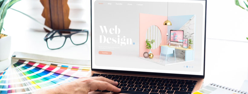
Hero images are images utilized to welcome your visitors onto the page. Likewise, with a growing interest in typography in the design space, typography-led hero images are making a wave. As the first part of any website that visitors see, these hero sections utilize bold text with unique fonts, focusing your audience’s attention on your key message as their first impression.
Typography hero sections are bold in their simplicity and command great attention the way a captivating news headline does. When you’re utilizing typographic hero images, make sure you showcase the text with tasteful, attractive, and creative lettering. A badly designed, WordArt style typographic will turn your minimalist design into a cheap trick.
Symmetrical Layouts
Quality design means creating a harmonious composition and balance between your elements. Generally, there’s two ways to organize elements in a design: by using symmetric or asymmetric layout. In 2021, we saw a huge increase in asymmetrical designs. However, clean symmetry has emerged as a reaction, embracing cleanness and simplicity.
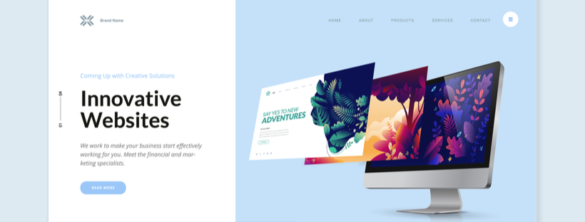
These designs balance each side of the page symmetrically with imagery and text. Some examples of symmetrical layouts include split pages and grid layouts. The key benefit of symmetrical layouts is that they allow you to draw attention to intentional places.
For instance, if a website page is divided into two content blocks – visual and text – it offers a clean way to split the focus and provide a structure for your information. By using minimalist divisions within the layout, such as thin lines dividing sections, symmetrical layouts also showcase a contemporary move towards clean design language.
Visible Borders
With that in mind, another current trend is the return to the use of visible borders. Early Web 1.0 sites often used visible borders by necessity, as simple elements required visible borders to avoid clutter. Soon after, early 2000s minimalist designs utilized invisible frames and borders to organize the page.
However, with mainstream acceptance of the web in its mid 20s, nostalgic design trends that harken back to the 90s are in vogue. Visible borders provide a subtle, retro touch to your website.
Visually, visible borders clearly distinguish one section from one another, creating a grid of elements. This makes the website page easier to scan and enables the use of more content without clutter. Visible borders also work well for adaptive web designs, keeping your format clear across a variety of platforms. For mobile friendly sites, this can be particularly effective.
Abstract Graphics
Within the web design space, abstract graphics are rapidly gaining popularity. Abstract graphics offer designers the unique opportunity to mix and match various mediums to explore some interestingly unpredictable results.
For instance, by integrating organic textures, your web designer can provide a lifelike look. Alternatively, utilizing a set of hand-drawn scribbles can offer a hand-crafted feel to your site. By mixing and matching different sets of abstract graphics, there’s endless possibilities for visual texture.
Gender-neutral Designs

Over the past 10 years, gender roles and the public perception of gender identity has radically changed. Likewise, gender-neutral designs are now becoming a standard trend. Gender neutral designs icreate a baseline of accessibility for all visitors going beyond societal assumptions of taste and aesthetics.
For instance, you can utilize soft pinks and pastels within a site that doesn’t target exclusively women. Likewise, masculine design elements such as dark grays and sharp shapes can be used outside of male-gendered spaces. By avoiding assumptions about the tastes of your demographics, you invite a more diverse audience into your website.
White Space
However, 2022 has also seen a return to another trend in web design: minimalism. While not all web designs utilize minimalist elements, the strategic use of white space or negative space has grown in importance.
By using this negative/white space judiciously, designers can keep the layout of their web page simple and help users focus on important pieces of content. This is especially important for image and video centric sites, where the media is the focal point of the design.
Users are attracted to websites that feature interactive elements, and white space offers room for interactivity. While moving images may appear cluttered on a visually complex site, white space focused designs provide space for movement in dynamic scrolling.
Local SEO
Local SEO is another web trend that you can expect to stay strong among web designers in 2022. Local SEO refers to the utilization of SEO keywords and modifiers such as near me or close by. With more than half of all Google searches being driven by location, Local SEO integrates your site into one of the most common forms of search.
By using local SEO, businesses can attract audiences in a more personal way. For businesses with brick and mortar locations, Local SEO also provides your search results to a greater number of potential physical customers.


 Posted in

