No matter what type of business you operate, custom banners are a versatile and impactful marketing tool. Whether you’re advertising at a physical store or showcasing your brand at trade shows and conferences, custom advertising banners are a cost-effective way to boost brand visibility and leave a lasting impression.
Keep reading for essential custom banner design tips to create memorable and successful banners for your business.
Highlight Your Logo and Brand Identity
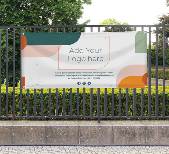
The top section of your banner is prime real estate for your logo, tagline, and key brand elements. This placement ensures your brand is instantly recognisable to your target audience. Even if you’re familiar with other marketing materials like banner stands, decals or rigid signs, remember that a strong visual hierarchy is crucial in custom promotional banners. Following your brand identity with clear, engaging messaging will make your banner more effective.
Align Colours with Your Brand
An effective banner marketing tip is to use colours that resonate with your brand identity. Sharp, striking colours can grab attention, but it’s important they align with your brand’s palette. This balance helps maintain visual coherence while drawing in your audience. When you design your own banner, ensure the colours support your brand and the message you want to convey.
Choose the Right Material
Banners don’t have to be limited to vinyl. Explore different materials like fabric, foam core, wood, or metal to give your banner a unique texture and presence. The material you choose can influence where your banner is displayed and how it interacts with its environment. Pop up banners made from innovative materials can add depth and dimension, enhancing both functionality and visual appeal.
Strategic Placement for Maximum Impact
Where you place your banner can make or break its effectiveness. Whether it’s a busy intersection or a high-traffic event, strategic placement ensures your banner reaches the right audience. Consider placement carefully during the custom banner creation process, as it influences design elements like colour contrast and text size.
Include Key Information
Clear, concise messaging is essential for effective custom banner design. Determine your banner’s goal – whether it’s increasing brand awareness or promoting a specific product – and tailor the content accordingly. Include essential information but avoid clutter. Simple, impactful messages are easier for viewers to absorb quickly.
Focus on a Clear Focal Point
Your banner should have a strong focal point, whether it’s a bold logo, striking image, or key text. Use colour contrast, larger images, and emphasized text to draw attention where it matters most. A well-defined focal point ensures that your message is conveyed effectively to onlookers.
Prioritise Text Clarity
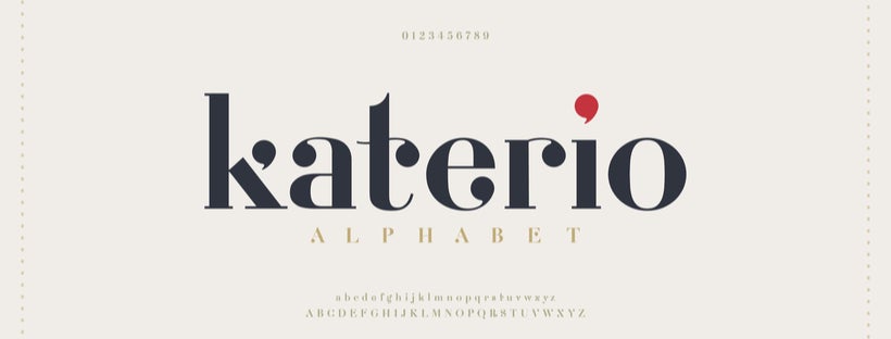
Readable text is critical in banner design for events and marketing. Avoid overwhelming the banner with too much text. Focus on a bold headline, clear fonts and a contrasting colour scheme to enhance readability. This ensures your message is accessible even at a glance, making your banner more engaging and effective.
By following these custom banner design tips, you can create banners that not only capture attention but also deliver meaningful results for your business. Whether you’re crafting custom banners for events, promotions or in-store displays, a well-thought-out design ensures your message resonates with your audience.


 Posted in


